ATS 2020 Virtual

Case Study
When ATS executive committee decided to have a virtual conference in 2020 with only months to prepare, we had a dilemma. How could we create a look that all the departments would agree upon in time?
I looked at the elements that were already agreed upon for our in-person conference: the colors, gradients and fonts, and added our corporate globe to symbolize our worldwide presence of this virtual conference.
Formerly, our globe was usually used symmetrically on flat blue in our corporate collateral, but the asymmetrical layout with the added dawn colored gradient focused on the edge gave it a look of depth as well as a positive feeling
We made our deadlines, because all of the elements had been previously agreed upon (colors, fonts and imagery) and could freely pass by rounds of meetings.
Good art direction is about making the content easily accessible and enjoyable to its target audience, while expressing the brand and company goals.
Sonja Kodiak Wilder
America Magazine
Case Studies
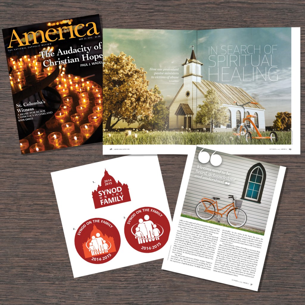
(From top left) cover: a river of church candles illustrated hope with a clean graphic element that had movement.
(Upper and lower right) story: The stakeholders wanted multiple illustrations to convey a story about those abused as children who still go to church as adults. I showed this delicate subject with a tricycle on a church on the first page, that grows up to be an adult bicycle on the second page.
(Lower right) icons for a special series: Multiple choices for icons are a must!
Freelance and niche audiences
Always interested in trying something new, I have provided art direction, design and production on books for niche audiences: a children’s book, a tattoo book, and a graphic novel. Contact me if you would like case studies or more information on these.
.
Contact me at
sonjakodiak(at)gmail.com